-
Details
- Date
- (1975)
- Media category
- Materials used
- colour screenprint on BFK Rives paper
- Edition
- artist's proof for edition of 26
- Dimensions
- 55.6 x 81.2 cm image; 75.6 x 105.0 cm sheet
- Signature & date
Not signed. Not dated.
- Credit
- Gift of the artist 2008
- Location
- Not on display
- Accession number
- 306.2008
- Copyright
- © Estate of Jan Senbergs/Copyright Agency
- Artist information
-
Jan Senbergs
Works in the collection
- Share
-


-
About
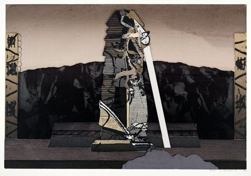
"I was trying to break into colour a bit more… not high pitched, but richer colour, trying to bring the colour in and retain sculptural form. One of the most colourful screenprints, nevertheless its colour is somewhat tempered. Senbergs believes that when his images are too colourful, the image is weaker, distracting attention from structure. Similarly he also deliberately eliminates figures because they suggest scale or humanize the space – in these early works he was most attracted to evocative ambiguity."
Jan Senbergs
[Hendrik Kolenberg, Jan Senbergs complete screenprints 1960-88, pg 67] -
Exhibition history
Shown in 1 exhibition
Jan Senbergs: from screenprints to painting, Art Gallery of New South Wales, Sydney, 27 Apr 2008–25 May 2008
-
Bibliography
Referenced in 4 publications
-
Hendrik Kolenberg, Jan Senbergs: Complete screenprints 1960-88, Sydney, 2008, 67 (colour illus.). cat.no. 54
-
Rudy Komon Art Gallery, Jan Senbergs: Paintings and silkscreen prints (1976), Sydney, 1976. NOTE: Impression unknown.
-
Tasmanian School of Art Gallery, Seven printmakers, Hobart, 1978, (illus.). cat.no. 29; NOTE: Impression unknown.
-
The Crossley Gallery, Jan Senbergs silkscreen prints (1975), Melbourne, 1975. cat.no. 11; NOTE: Impression unknown.
-