A Stella return
Frank Stella’s Khurasan Gate variation II 1970 is re-installed after conservation treatment. Artwork © Frank Stella/ARS. Licensed by Viscopy, Sydney
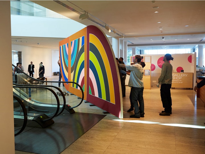
Anyone notice a nine-metre long, boldly striped painting miraculously appear in the Gallery last week? The work, Frank Stella’s magnificent Khurasan Gate variation II 1970, is a collection favourite – so where has it been?
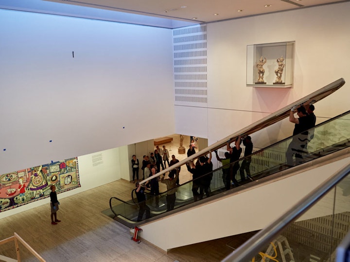
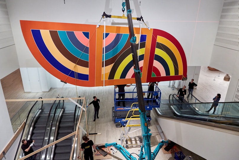
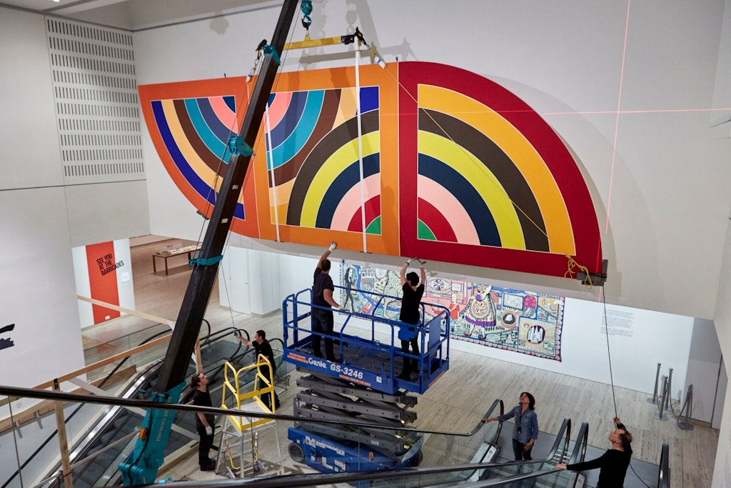
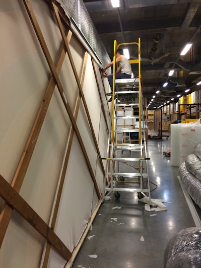
At the risk of being a little indiscreet, the great Gate needed a bit of a spruce up – quite a task for a painting that big. As you can see from the images in the slideshow below, even a ‘little’ refreshment required the considerable expertise of not just conservators but a host of Gallery staff, from registrars to the installation crew who worked with tiny spatial tolerances to safely fit it back in a rightful place of honour.
Art conservation is a tricky thing. When conservators treat a work, they strive for a visual integrity that balances the artists’ idea of their work and its physical reality – including not only the material reality but also its history, its use, its life.
In seeking that balance, the first challenge to a paintings conservator is, of course, the paint itself. Different paints have very different ways in which they behave. When it comes to treatment, modern synthetic paints (especially matte ones) have what conservators drily call ‘unforgiving surfaces’.
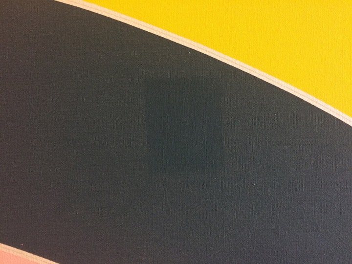
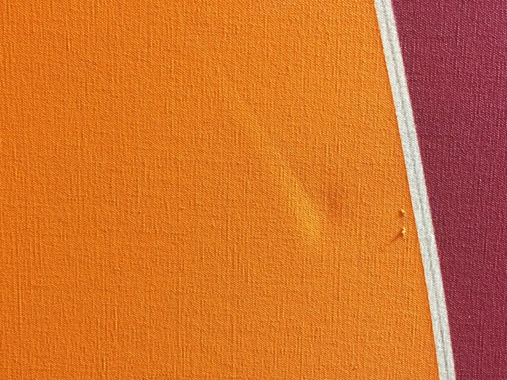
On the very smooth, flat, monochromatic surfaces of minimal or colour-field paintings, small cracks, dirt and scratches – perhaps barely, but just, perceptible to the naked eye – become out-of-proportion visual blips. Although we may be barely conscious of these disruptions to the picture plane, somehow, at some level, they jump out at us. Light gets reflected differently around scratches or dirt and our eye becomes distracted, our whole viewing experience compromised. While this is true of any damaged work of art, flat colour proves even more problematic and more noticeable.
There’s also something else going on. A lack of illusionism was at the heart of much abstract modernism. This was painting about painting, making reference to its own formal qualities, colour, line, scale, etc. Such formalist works as Frank Stella’s – or more carefully put, works valued according to formal analyses alone – encourage a different relationship to aesthetics.
Stella’s paintings from the Protractor series are like a ‘mosaic of colours’ (that’s William S Rubin who wrote a great monograph on Stella). And, like a mosaic, the colour is flat, even and un-modelled – there’s no attempt or desire to produce any illusion of receding space. This prevailing two-dimensionality makes flatness critical to reading the relationship of one colour to the other.
Rubin again: ‘The success or failure of any picture [in Stella’s series] depends precisely on the rightness of the color combination.’ The combination of colours is the magic that holds each work together, what makes it sing. If a red is electrified by the purple adjacent to it, then any pigment change – the result of paint deterioration or damage – that transforms that red from say, more crimson to more scarlet, can destroy the balance of the work. What’s more, if those colours need to be kept ‘pure’ from edge to edge and there’s no blending, it becomes very hard to hide any surface flaws in non-existent highlights and shadows.
Stella is quoted by Rubin as saying: ‘My main interest has been to make what is popularly called decorative painting truly viable in unequivocal abstract terms. Decorative, that is, in a good sense, in the sense that it applied to Matisse.’ Like Matisse, Stella needed colour that was flat in order to emphasize its abstract-ness – remember Matisse’s cut outs? Coloured paper became Matisse’s preference in part because the purity of its colours allowed no adulteration of the distinct rhythm of his harmonies (check out his Jazz series in the modern gallery right now to see what I mean).
There’s another, related, thing: Frank Stella exploited shape – the rectangular or later, as here, more elaborate shapes of his canvases – as a medium. As such, his paintings are also very much objects (though as Stella put it, his is ‘a special kind of object – one that is intended to be a painting’) and rely like any constructed object, on their structure. Just as you can’t shave a strip of wood from a table leg and still have it stand upright, you can’t risk visual disturbances such as surface marks or dents in a work like Khurasan Gate variation II, without the stability of the object being compromised.
No pressure, then, for the conservator of such a piece!
You can follow the journey Stella’s work took to restore its beautiful, composed rhythm, under the care of Gallery paintings conservator Céline de Courlon, who writes about the conservation treatment in this image gallery, assisted by Melissa Harvey, who worked on the stretcher bar lining and new hanging system.
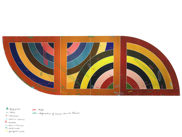
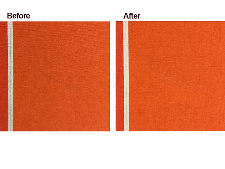
Close examination of Khurasan Gate variation II revealed damage to the paint film - including dust, scratches, abrasions, scuffs, drips, stains, fingerprints and pencil marks - which disturbed the artwork's visual aspect, and with it the artist’s intention. These matte, flat, even surfaces represent a real challenge for conservators and are extremely fragile. Scratches, abrasions and scuffs are usually retouched but making them ‘disappear’ can be very difficult as the retouched areas have to perfectly match the colour of the original paint and its finish. Dirt such as stains, fingerprints or pencil marks are almost impossible to clean as they become too embedded in the porous paint film.
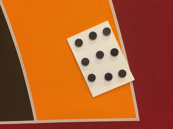
The traditional way to flatten a dent on a canvas is to place the painting on a flat surface face down and to apply pressure with weights and moisture to the back of the deformed area. Considering the size of Khurasan Gate variation II, this method was not an option. It was decided instead to work with the painting upright and replace the weights with magnets (pictured here). The dents that could be reached without moving the painting were treated that way, and the others were left untouched.
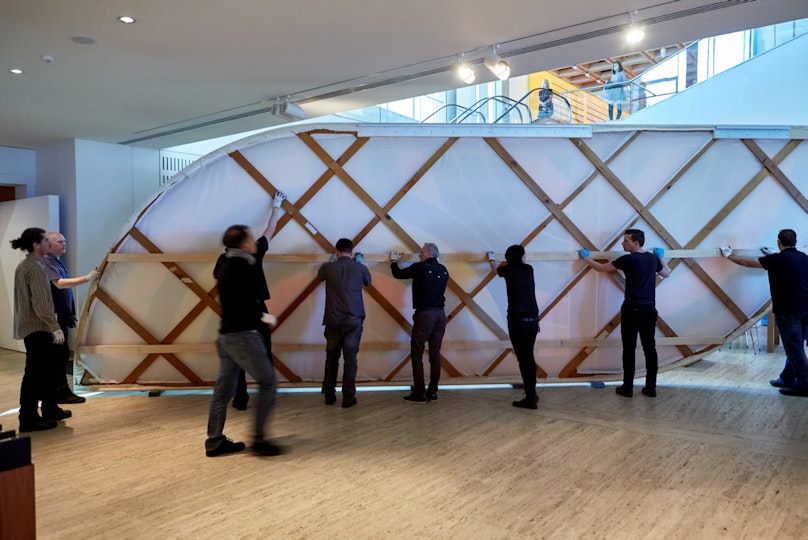
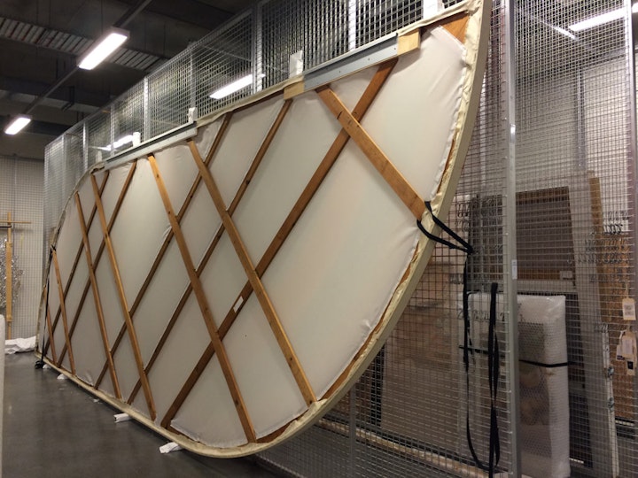
After conservation treatment, the work was returned to the Gallery. Many experienced hands were needed to get Khurasan Gate variation II into position. (In this image, you can clearly see the new stretcher bar lining.)